
Case study · Logo design & vector production
Los Nicas Distributors: one picture, a full logo system
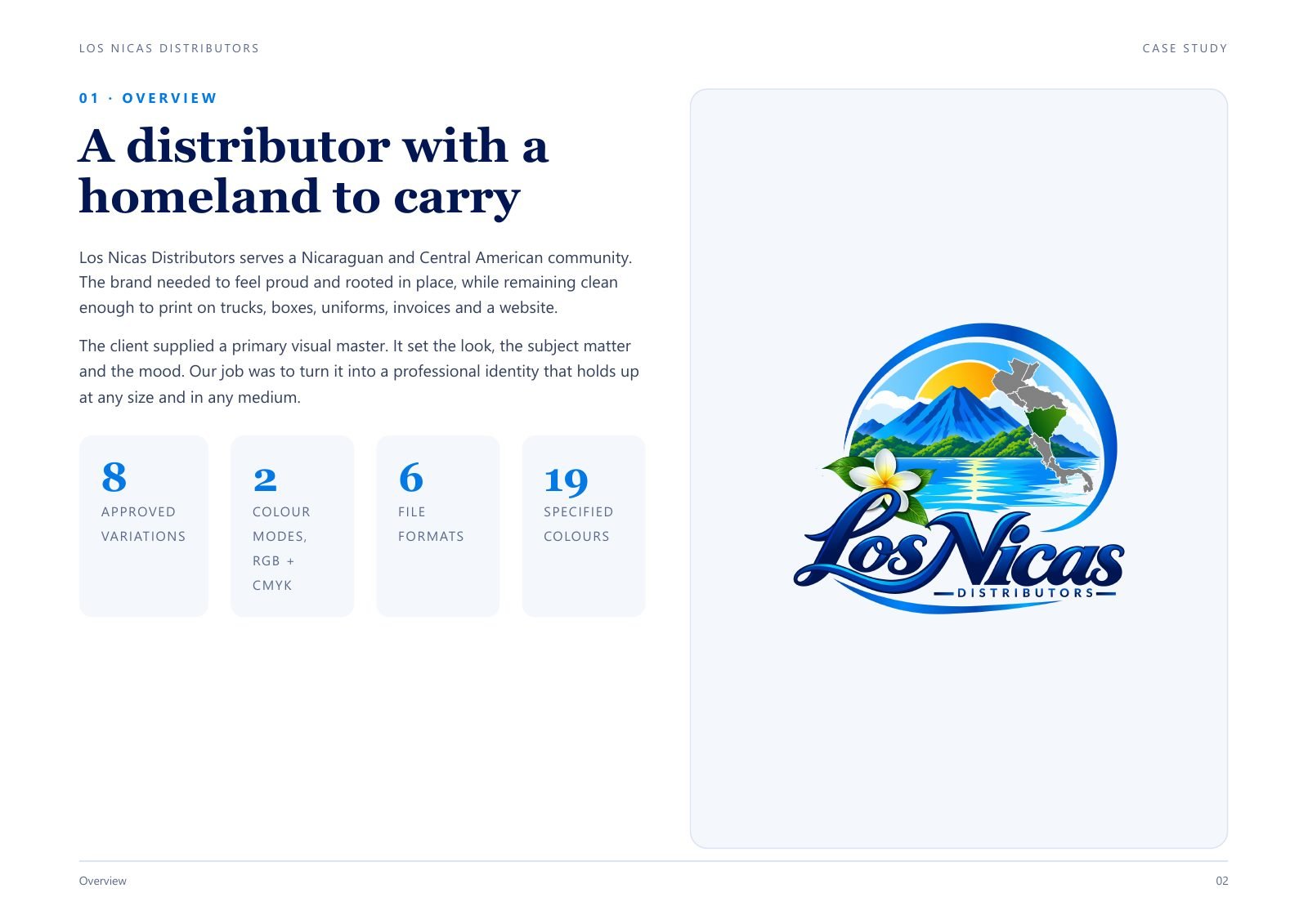
Los Nicas Distributors serves the Nicaraguan and Central American community. The client had one approved picture. It needed to become a full logo system that prints cleanly on trucks, boxes, uniforms and invoices.
A distributor with a homeland to carry
The brand needed to feel proud and rooted in place, but also stay clean enough to print on almost anything. The client’s picture set the look, the subject and the mood. My job was to make it hold up at any size.
The starting point
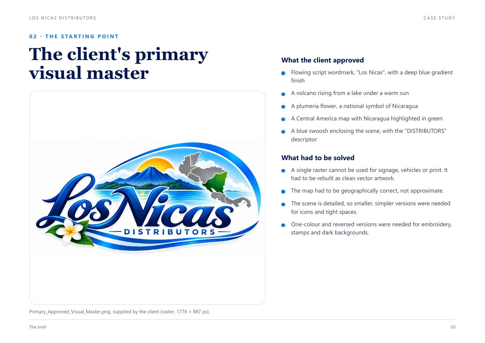
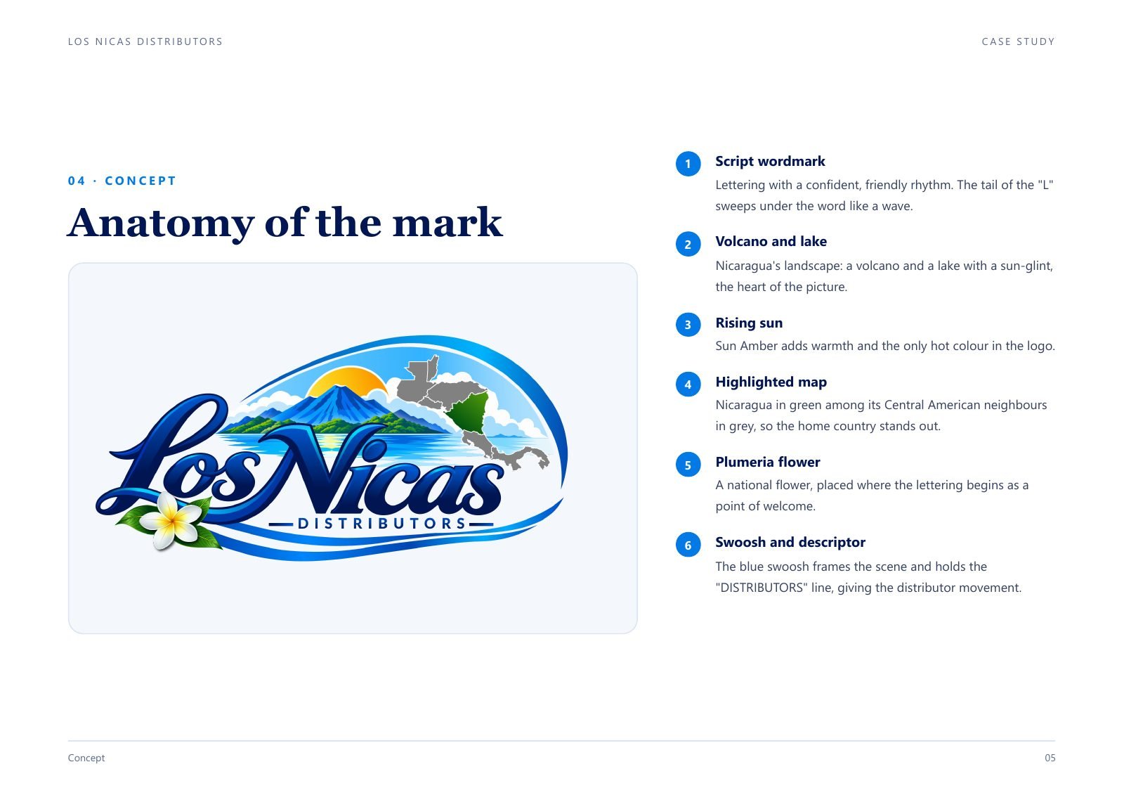
The approved picture had a flowing blue script wordmark, a volcano rising from a lake under a warm sun, a plumeria flower, a map of Central America with Nicaragua in green, and a blue swoosh around it all.
A single raster like this cannot be used for signs, vehicles or print. The map also had to be correct, not approximate. And the logo needed smaller, simpler versions, plus one-colour and reversed versions for embroidery, stamps and dark backgrounds.
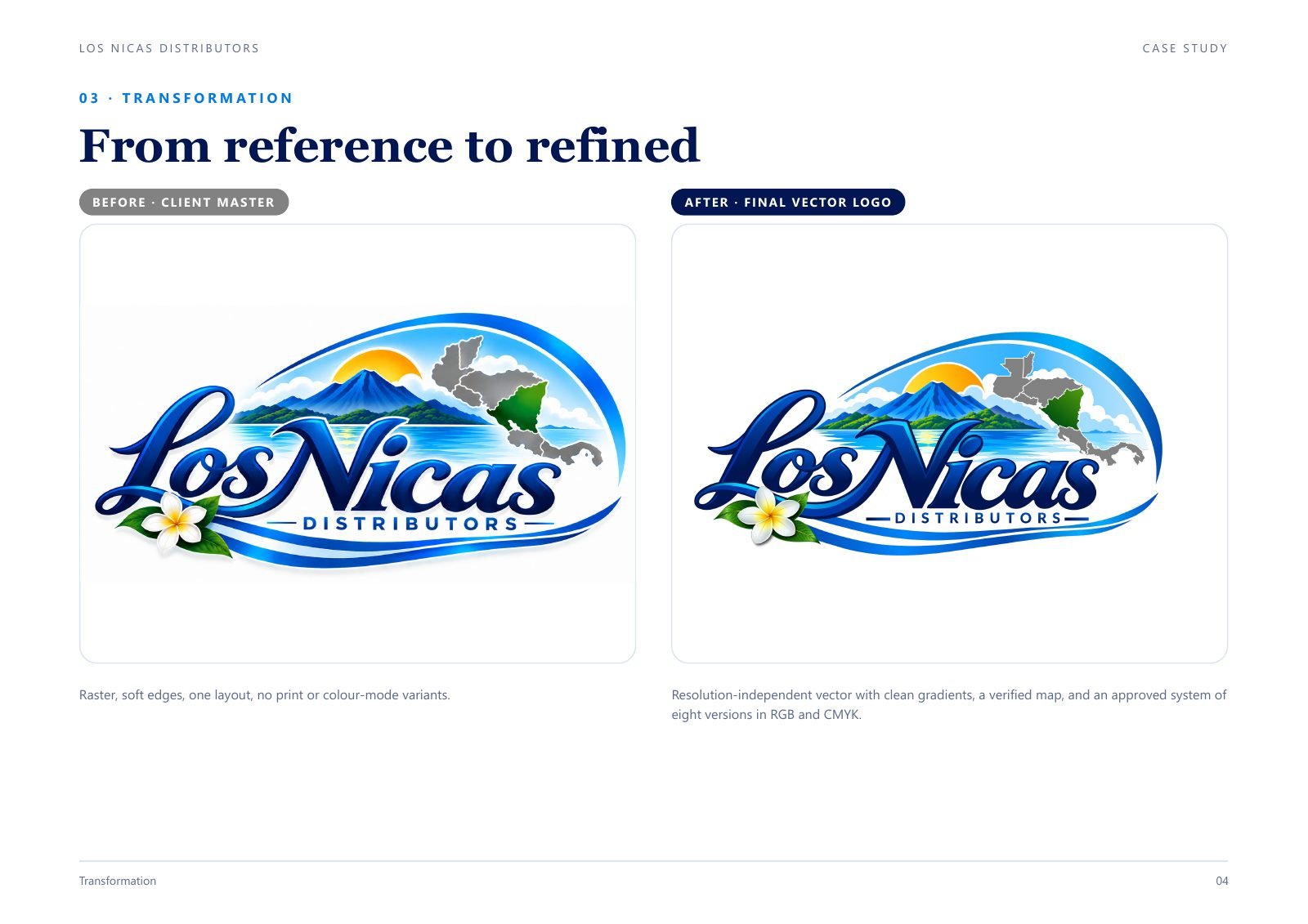
From reference to refined
I rebuilt the whole mark as clean vector, with smooth gradients and sharp edges, in both RGB and CMYK.
Anatomy of the mark
Every part has a meaning: the lettering, the volcano and lake, the rising sun, the highlighted map, the plumeria flower and the swoosh that holds it together.
A wordmark built to flow
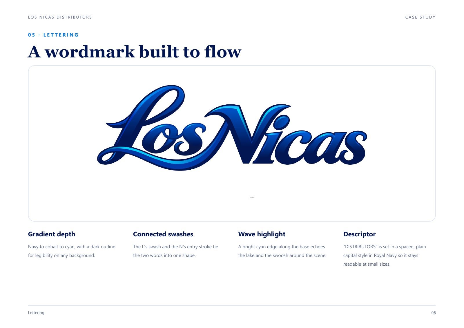
The lettering was redrawn so the curves are smooth and the strokes connect naturally. It keeps a deep blue gradient, a wave highlight and a small descriptor line.
A map drawn from real data
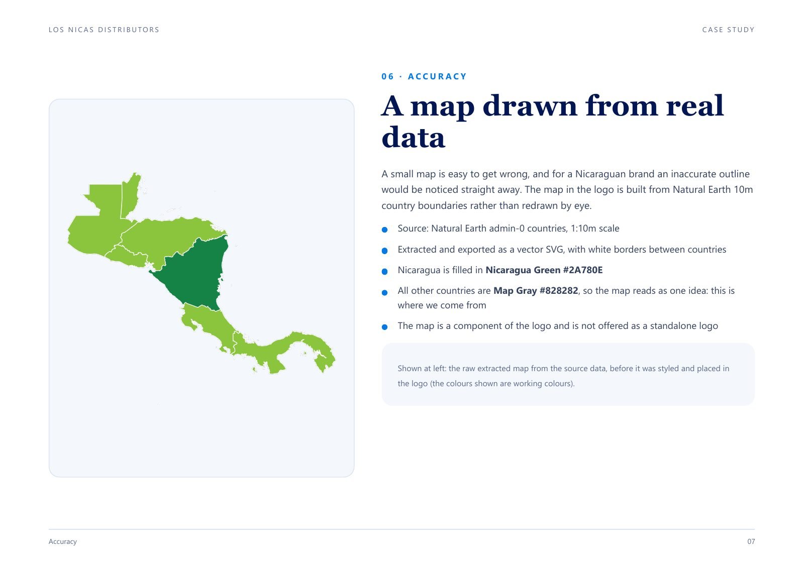
A small map is easy to get wrong, and a Nicaraguan brand cannot have an inaccurate outline. I built the map from real geographic data, then simplified it so it still reads at small sizes.
The palette
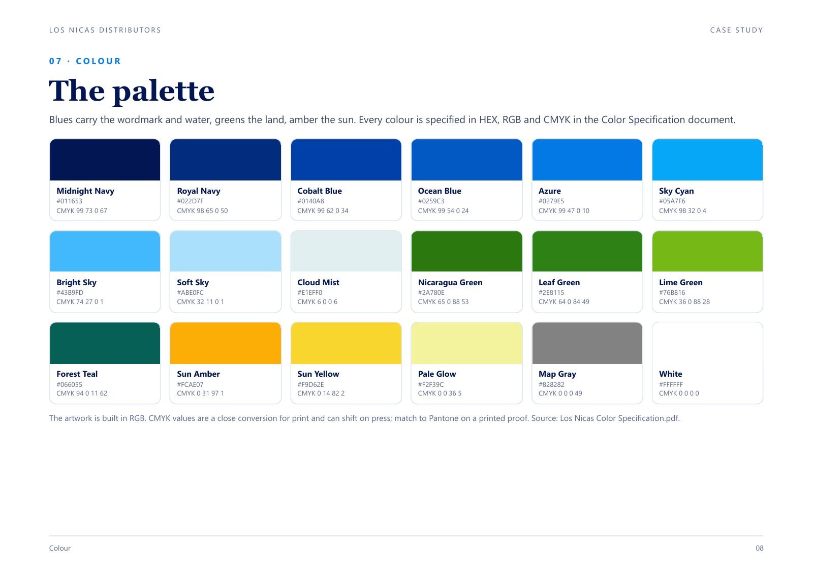
Blues for the water, greens for the land and amber for the sun. Every colour is specified in HEX, RGB and CMYK, so the printer and the web developer use the same colours.
Eight versions, one identity
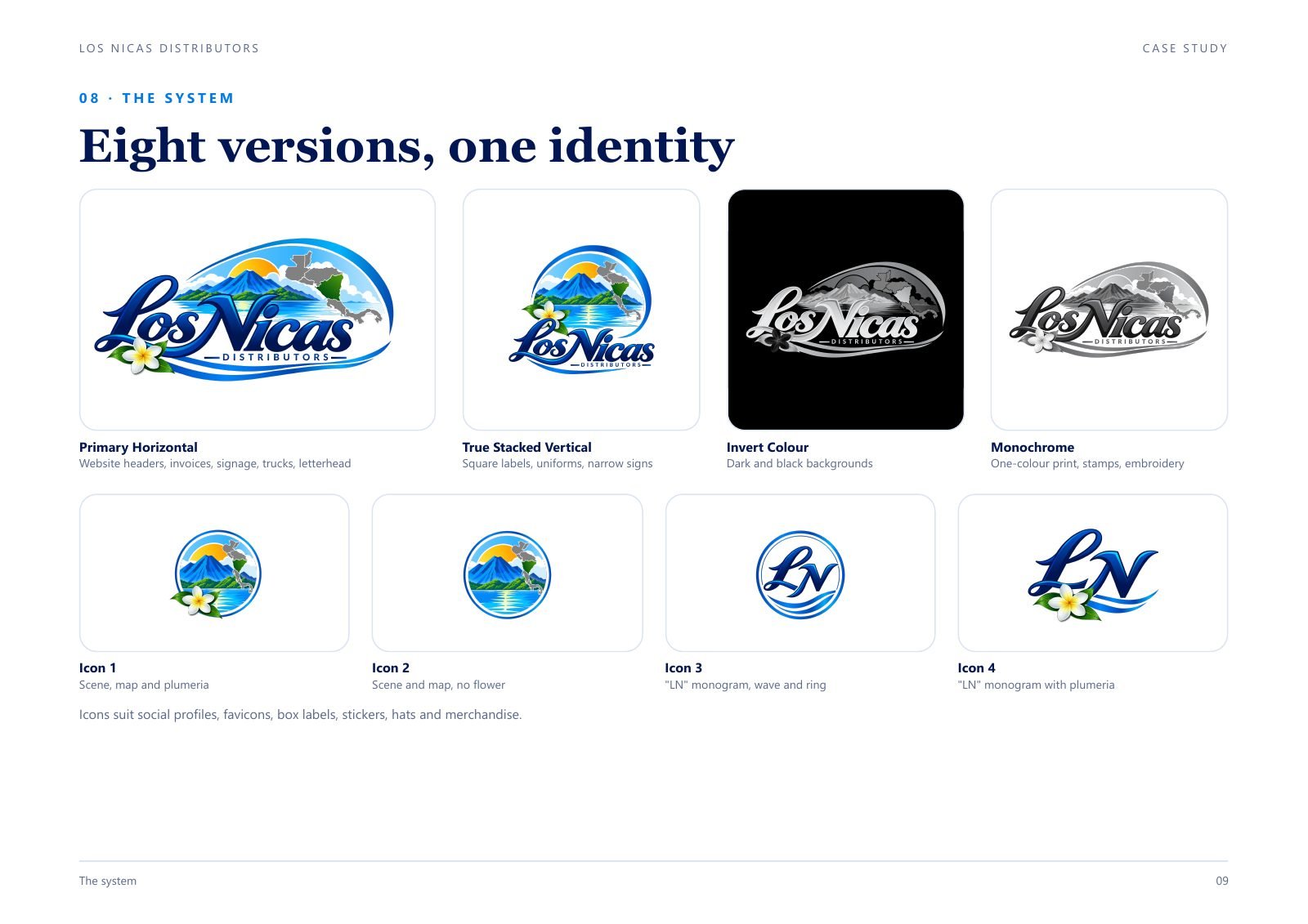
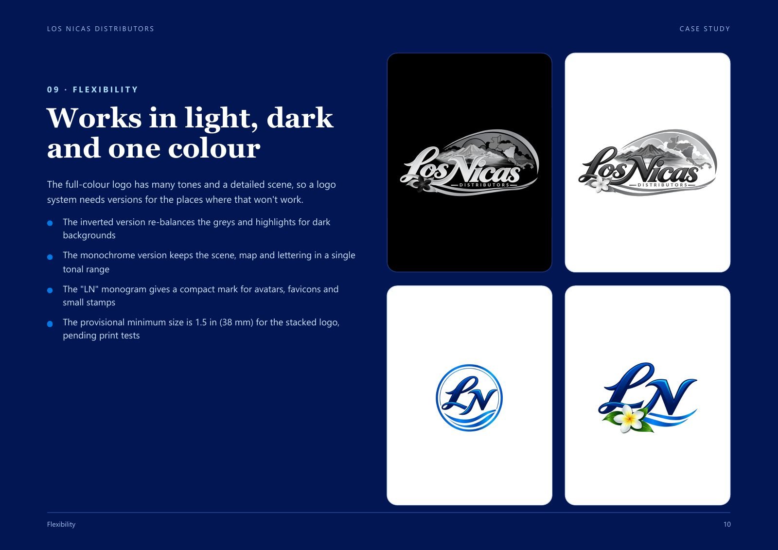
The full-colour logo has many tones, so I made versions that work on other backgrounds and in tight places: a horizontal logo, a stacked logo, an inverted version, a one-colour version, and four icons.
A complete, ready-to-use package
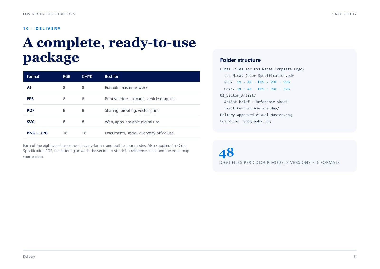
Everything is organised by colour mode and file type, with a colour specification sheet, so nobody has to ask which file to use.
One identity, ready for every surface
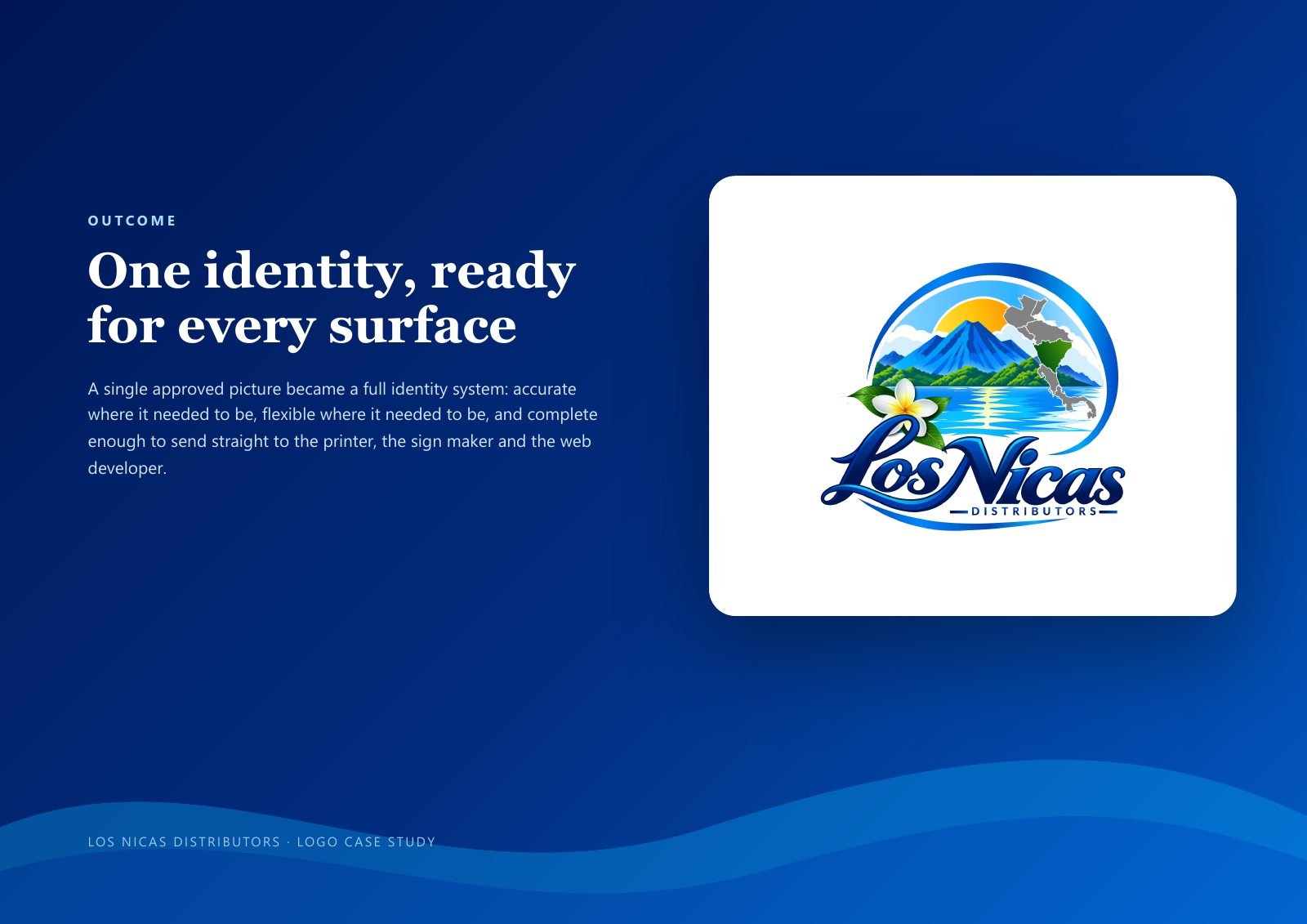
The client now has one approved identity that can go straight to the printer, the sign maker and the web developer.
More like this: see all my work, or learn which vector file to use.
Need a logo system, not just a logo?
Tell me about your brand. I will reply with a clear plan, price and timeline.